Background
The Global Experience Language (GEL) is the BBC’s shared design framework which enables us to create consistent and delightful user experiences across all of our Digital Services. The GEL Guidelines help our teams assemble online services, be they apps, websites or games, whilst our Design Principles underpin our user-centred approach.
Problem
In 2010 a website was published showcasing GEL. Due to limited resources the BBC were not able to build with a content management system. This meant we couldn’t update the sites content. Given the web’s rapid rate of change and everything moving to responsive design, the site and it’s content began to date instantly. Meanwhile there was increasing need for GEL guidance which gave rise to many internal sharing and storage solutions.
A new website
In 2014 we began to rethink our website. Our goal was to create a site that would assist and inspire the digital design community.
We started by researching our audience - how would they use it? what should it provide? who else might it benefit? From a series of user interviews and staff surveys across the business we were able to identify a core set of personas and user needs -
Existing UX&D staff - Show me the latest guidelines!
New UX&D staff - How do I get started designing with GEL?
Internal wider audience / External wider audience - What is GEL?
These personas helped us place the user at the front of every conversation and decision we needed to make moving forwards.
We knew the resulting experience had to work on every level. The site would need to be constantly updated – so the need for a content management system was a given.
We spent a lot of effort on the technical solution, editorial (the quality of writing and content) and the information architecture (how content was structured). We also wanted to strip back the front-end styling to a more “bare bones” presentation so we could accomodate a new BBC font that was on it’s way.
Ideation
I led a series of ideation workshops with my UX design team, where we identified some core design principles that we wanted the new website to adhere to -
Practice what we preach
Feel alive
Be efficient
Create conversation
Become a showcase
I then led the design team to come up with a variety of different concepts that could support these design principles - in a short period of time the team came up with over 40 different ideas. These needed to be prioritised, so I took the Creative Director and Head of UX through each concept at a team critique, and we identified what we wanted to take forward and those we would ditch.
Some concepts we liked…
Air traffic control - A concept that we liked but didn’t make it through included ‘air traffic control’ - everyone across UX&D knowing what others were working on - this transparency would allow teams to easily spot when others were working on the same design pattern - but this would require a lot of effort that we didn’t have the time or resources for.
Interactive coded demos per guideline - A concept that made it through included having an interactive coded demo associated to each guideline - that could be reused and re-skinned. We created early prototypes of this concept and got early user feedback by sending out the prototype to internal BBC staff - the feedback led us to investigate this further - and think about a coded version of GEL.
With the Delivery Manager using the MoSCoW approach we managed to create a UX backlog of up and coming work moving forwards.
Content structure
With the information architect we came up with the underlying structure of the website. Through an audit of existing GEL guidelines, it was clear these needed to be re-written, as collectively they were inconsistent with each other - written over different periods of time by different people for different people and purposes. There was a clear lack of structure to the documentation, no consistent tone of voice, labelling and now they were not up to date.
Our ambition was to make our guidelines searchable and easy to read. We wanted to ensure we had a solid structure in place when we launched the website. We also wanted to ensure that those contributing to the site were armed with the right information to ensure all output is consistent.
We printed out all of the guidelines and started to identify a common set of themes/templates that a principle / guideline / pattern should contain.
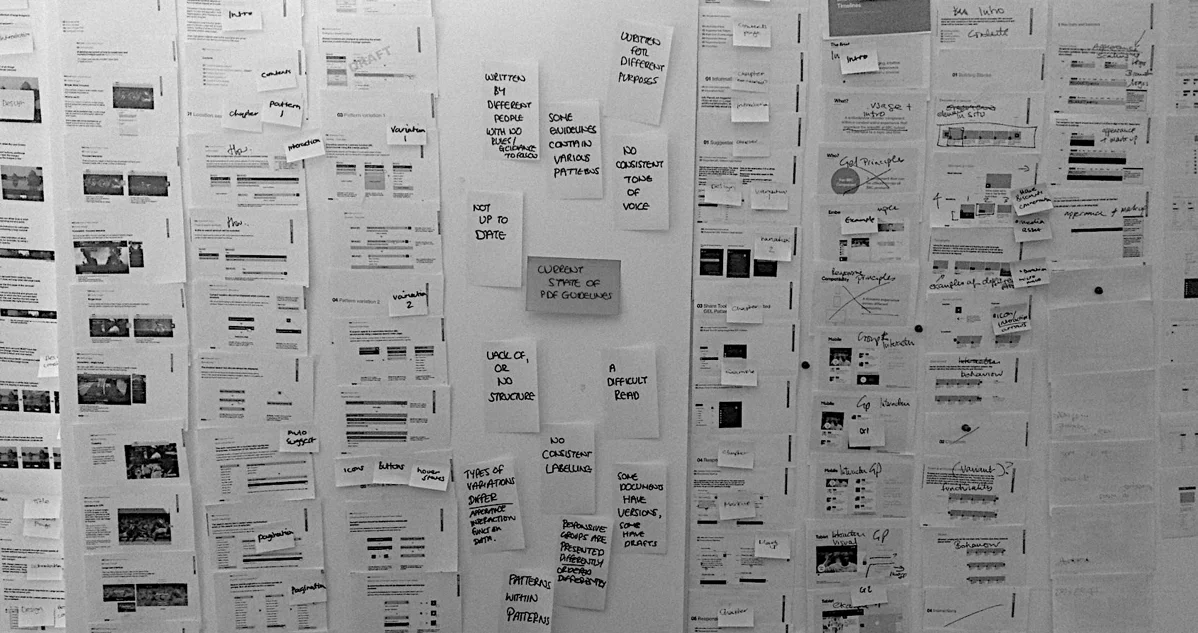
On the back of this our information architect updated our flows / wireframes / navigation structure and urls with these findings.
The 'Content Creation Kit' was born
On the back of our content audit I commissioned and led a piece of work with my designers to create a Content Creation Kit as part of the GEL website redesign. This kit included guidance not only on the structure and tone of voice of a guideline, but also recommendations on how to create consistent infographics for the website in the variety of sizes we needed to upload using the content management system.
Visual design
Another key challenge was creating the updated visual layer for the site, we weren’t redesigning the look and feel of the BBC here, we had to retain GEL’s current visual language, but design in a way that would feel like a refreshed site allowing for a new BBC font to replace our existing one.
I decided to run a visual design sprint with my design team across both Salford and London. We spent 5 days using a sprint process -
Understand - Looking at what our competitors were doing and took inspiration around us to create moodboards to represent what the look and feel could be.
Diverge / Converge / Prototype - We then tried to re-skin the GEL homepage as many times as possible through a series of ‘first burst’ sessions. Each ‘burst’ consisted of 40 mins design, 20 mins review. This forced us to not spend too long over-designing things. Over the next couple of days I got the designers to come up with over 60 designs - we narrowed these down to a select few options using a dot voting approach. A look and feel was starting to become visible.
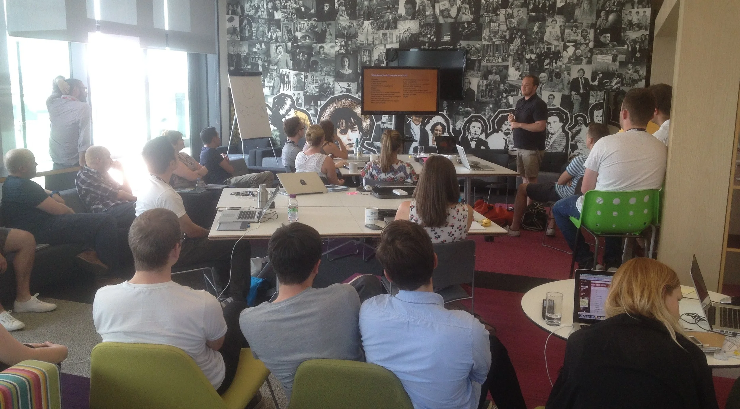
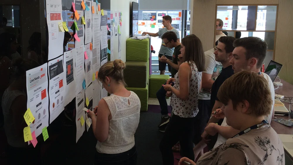
Test/Feedback - At the end of the design sprint, I arranged for the design team to get user feedback from the wider UX&D team. I presented what we were doing then ran a silent design critique which allowed users to add their feedback.
Silent crit in London
Silent crit in Salford, Manchester
As a team we later reviewed this feedback and it became clear what steps we needed to take next and which designs got preference over the others.
Following the design sprint, we had a strong visual style that was sympathetic to our original goals and we applied these to our wireframes and evolved these over time.
Build
With the arrival of our new GEL Developer Advocate we started to hand over the designs for build. Ensuring that we were part of the build review stages
Communication
As this was a website for the UX&D team I had to present the work we were doing on many occasions at Creative Leadership Meetings and at Away Days. This was to ensure the business was kept out to date on the progress of our work. We then started to communicate outwards using regular mail outs to the team.
Yikes - it's me who has to publish this stuff!
As we had no content producers in our team, I quickly learnt how to upload and publish content using the content management system we connected to the GEL website. The content creation kit and the workflow I had set up really helped transferring all the guidelines into a web friendly format and it was a smooth transition when putting live onto the site.
Outcome
After the site was redesigned and relaunched I handed over this role of content producer to other GEL team members and since then 49 guidelines have now been created across UX&D using the content creation kit and published to the website using our CMS.
The look and feel worked well when the new BBC Reith font was announced and was successfully swapped out with our existing website fonts of Helvetica.
The GEL website is used by all UX&D staff across the BBC.
Learnings
On reflection I think this project would have benefited from being designed and built in a more agile way, as opposed to using a waterfall type process. Our team was small and didn't work like our external facing products with big development teams. A benefit to trying this approach would mean we'd be able to test early on live build and iterate as we moved forwards.